
Every campaign ends with the same question: how did it actually do? The honest answer takes one to three days. Someone exports from a dozen dashboards, reconciles metric definitions that disagree with each other, builds the comparison charts, and writes the deck. By the time it lands, the next campaign is already in design, so the findings get filed.
That is the real cost of slow campaign performance analysis. The work is not hard. It is just slow enough to arrive after the decision it was meant to inform.
Why does campaign performance analysis take three days?
Three things stretch it out, and none of them are analysis.
The first is collection. Channel data, payments, retention, user tiers, and item consumption each live in their own report, exported by hand, with definitions that do not line up. A payment rate uses one population in one report and a different one somewhere else. Stitching that together eats half a day before anyone learns anything.
The second is presentation. Charts get rebuilt, the deck gets laid out, and one to three days go into how the findings look. The thinking gets whatever is left.
The third is the shape of the review itself. Channel, payments, and retention each sit with a different owner, and each pulls only their own module. The result is a patchwork where every number looks fine on its own. Acquisition volume normal. Total payments on target. Participation above the last campaign. Nobody connects the chain that runs across all three.
What should campaign performance analysis actually answer?
Four questions, in this order.
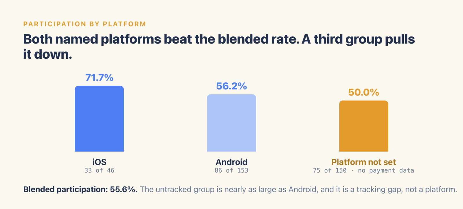
Who did it reach? Participating users, the participation rate among active users, and how that rate differs by platform. In one test campaign, 194 of 349 active users triggered the participation event, a 55.6% participation rate. Split by platform, iOS came in at 71.7% and Android at 56.2%.
Both of those sit above the blended number, which is the interesting part. A third group, users whose platform property was never set, is as large as Android's and drags the average down. That group also shows no payment data at all. The report surfaced a tracking gap that no channel review would have found, because on the channel dashboard those users simply look like a smaller platform.
What actually moved? Campaign week against the prior week on daily active users, payment rate, and per-user payment, separated into campaign-driven change and normal fluctuation. Without that split, a good week gets credited to the campaign and a flat week gets blamed on it.
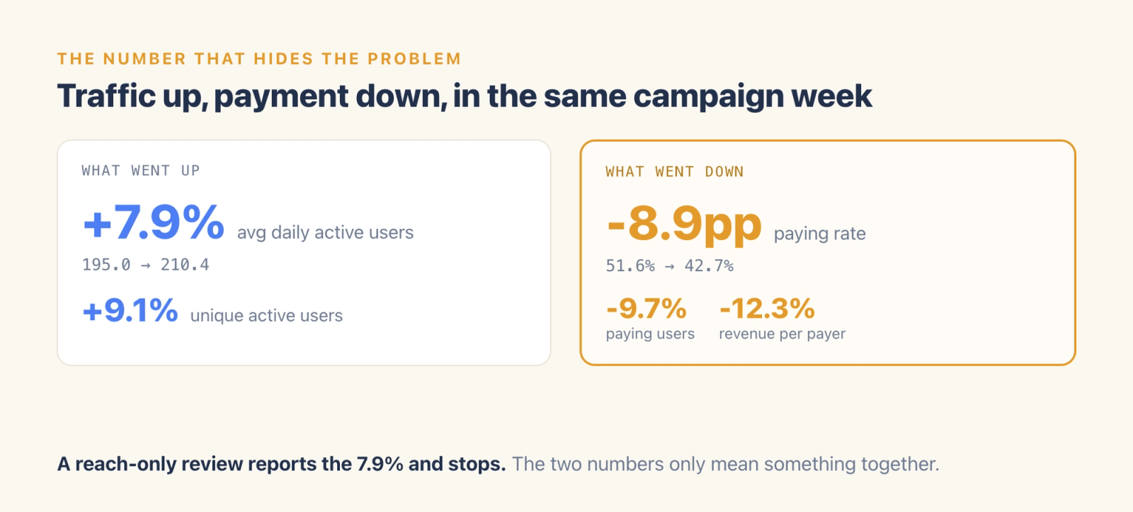
The test campaign is a clean example of why this dimension earns its place. Traffic went up: average daily active users rose 7.9%, from 195 to 210. Payment went the other way. Paying users fell 9.7%, the paying rate dropped 8.9 points from 51.6% to 42.7%, and average revenue per paying user fell 12.3%. The campaign brought more people in, and a smaller share of them paid.
A reach-only review would have reported the 7.9% lift and stopped. A payment-only review would have reported a bad week with no explanation. The two numbers only mean something together.
Where did it break? The funnel from active during the campaign, to participated, to paid, with the worst drop-off flagged. This is where a single number replaces a week of guessing.
How does it compare? The same metrics against similar past campaigns, so "up" and "down" have a reference point. A 55.6% participation rate means nothing on its own. Against the previous seasonal sale it either beat the bar or missed it, and that comparison is what turns a number into a decision. Unique active users in that test campaign came in at 349 against 320 the prior week, a 9.1% lift, which reads very differently depending on what the last three campaigns did.
Most teams answer one or two of these four and call it a review. The gaps are predictable: reach gets measured because it is easy, the bottleneck gets skipped because it needs a joined funnel, and the benchmark gets skipped because nobody kept the prior campaign in a comparable shape.
Why does "we hit the target" hide the problem?
Because an aggregate is an average of people having very different experiences.
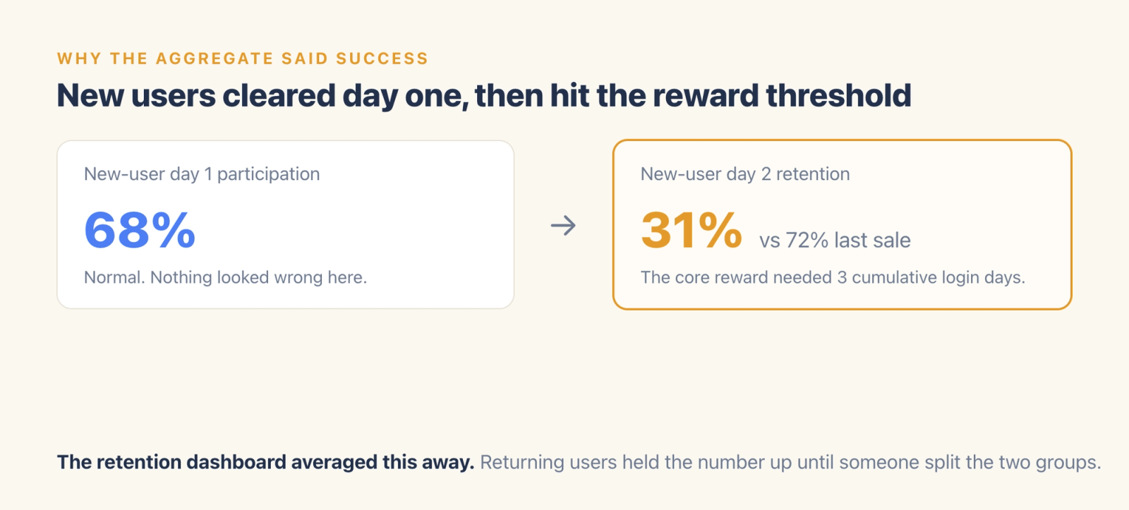
One campaign in the test project hit its payment target. Underneath it, new users participated at 68% on day one, then retained at 31% on day two against 72% in the previous seasonal sale. The core reward required three cumulative login days. New users joined on day one, could not qualify, and left before they ever reached a payment screen. Existing users' spending propped up enough of the total that the campaign still read as a success against its headline goal.
The retention dashboard showed average daily retention during the campaign, flattened by healthy returning-user numbers. Only splitting new from returning users exposes the cliff.
This is not sloppy operations. Cross-module analysis costs too much in the manual model, since it takes three specialists in one room, each holding only their own report. The chain that mattered here ran campaign bar to new-user retention to payment conversion, and it crossed all three of their modules. Any one of them looking at their own dashboard would have signed off.
What does automated reporting change about the timing?
It moves the report to the day the campaign closes.
An agentic analytics system takes the campaign window and the core goal, links that period to full-funnel behavioral data, and returns the four dimensions above as a structured report. Reach, drivers, bottleneck, benchmark. It then drafts specific next steps: lower the entry requirement, add a beginner path to the core reward, connect the participation screen to a first-purchase offer, repair the user property that is producing the unset group.
Timing is the whole point. A report that arrives the day the campaign ends feeds the next campaign's design while the context is fresh. The same report two weeks later gets read once and archived, because the next campaign is already built.
What does the agent assemble, and what does the ops owner decide?
The agent does the assembly. It scans campaign events and behavioral data and joins them across modules. It groups users by platform, tenure, and payment behavior, then ranks the funnel losses by size. It compares the campaign against the prior week and against similar past campaigns, and drafts the recommended next steps with the evidence attached.
The ops owner does the judging. They decide which finding matters for the next campaign, whether a 31% day-two retention number reflects the reward threshold or something else entirely, which recommendation fits the roadmap, and what ships. They also decide what to do about the tracking gap, which is a data quality call with consequences beyond this campaign.
That division is what makes same-day reporting safe. The evidence arrives complete and fast. The interpretation stays with the person accountable for the next campaign.
What changes when the report arrives on time?
The ops team stops being a data-moving function.
The hours that went into exports, reconciliation, and deck layout go into reading conclusions and adjusting the plan. Structural problems surface while there is still a campaign to fix them in. And the review stops depending on which specialist happened to look at which dashboard, because the four dimensions get answered the same way every time.
Get the whole white paper

This article is one use case pulled out of the Agentic Engine white paper, where campaign review is chapter 6. The chapter carries what a blog post has to leave out: the four-dimension report template, the metric definitions behind every number, and the benchmarking method, plus a real customer case with what changed and what it cost.
Fourteen chapters cover the same ground for user acquisition, live operations, monetization, data engineering, and player support teams. Every one of them keeps a person at the approval step.