

A team reviews its weekly churn rate and sees a stable percentage. The meeting still cannot answer which customers left, when they left, whether high-value accounts were affected, or whether the number moved because of customer behavior or a reporting change.
A headline rate can combine customer losses, revenue losses, cohort differences, lifecycle patterns, and denominator changes. The percentage may be calculated correctly while answering the wrong business question.
Churn rate analysis is what happens after that meeting: someone opens the definition, checks who is in the denominator, and keeps cutting the number until the loss has a name.
How Churn Rate Analysis Defines the Number
Write the metric definition beside the chart before investigating a change. Four questions expose the important ambiguity.
What entity is counted? The report may count customers, accounts, subscriptions, seats, or workspaces. An account with five subscriptions produces one result in an account view and five possible events in a subscription view. A cancelled seat can appear as churn while the account continues paying.
What event marks churn? A recorded cancellation, failed renewal, expiration without renewal, pause, or sustained inactivity defines churn at a different point. A cancellation report may show when a customer clicked cancel. A renewal report may show when a subscription failed to renew. An inactivity report may show a warning signal before the billing record changes.
Who is eligible during the window? A calendar-month report may begin with all active customers on the first day of the month. A renewal report may include subscriptions whose renewal date fell inside that month. An activation report may include accounts that reached a defined product milestone. Put the eligibility rule beside the rate. Without it, a chart can appear to improve because recently acquired or not-yet-eligible users entered the population.
Is the result about customers, subscriptions, or revenue? Customer churn counts relationships lost. Revenue churn shows the associated financial movement, including the treatment of downgrades, expansions, discounts, credits, and pauses. Keep these labels visible wherever the rate appears.
Write your own event names, entity definition, denominator and calculation cycle down where the report can cite them. Until those four are fixed in one place, treat week-over-week movement as a measurement lead and a possible customer signal.
The denominator can produce a visibly wrong chart.
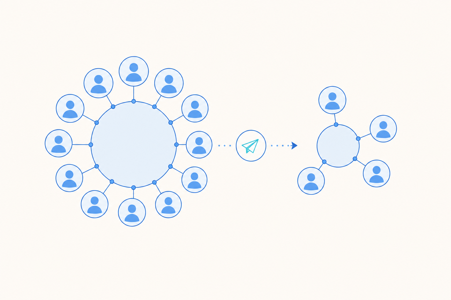
If a monthly rate uses all customers active at the end of the month, a month with many new signups may show artificial improvement because those customers had little time to churn. If the report uses only customers eligible for renewal, the rate can rise sharply when a large annual cohort reaches renewal. Both charts may be internally consistent while describing different populations.
For the full treatment of [how to calculate churn rate](https://thinkingai.io/blog/how-to-calculate-churn-rate/), including the churn rate formula, arithmetic, and foundational benchmark material, use the dedicated guide. Here, the calculation matters because its object, event, window, and denominator decide which customers appear in the review.
Compare the current definition with the previous one before assigning a product explanation. Check identity joins, billing status, plan mappings, timezone handling, event names, and backfilled records. A reporting change can produce a clean break in the trend line. That break belongs in the analysis even when customer behavior has not changed.
How Churn Rate Analysis Finds Hidden Cohort and Lifecycle Changes
Start with a cohort chart whose lifecycle ages can be compared directly.
Choose the cohort date according to the decision:
- Use signup date to inspect acquisition quality.
- Use activation date to inspect onboarding and time to first value.
- Use first payment date to inspect the early paid experience.
- Use renewal date to inspect the renewal journey.
Plot each cohort at the same age.
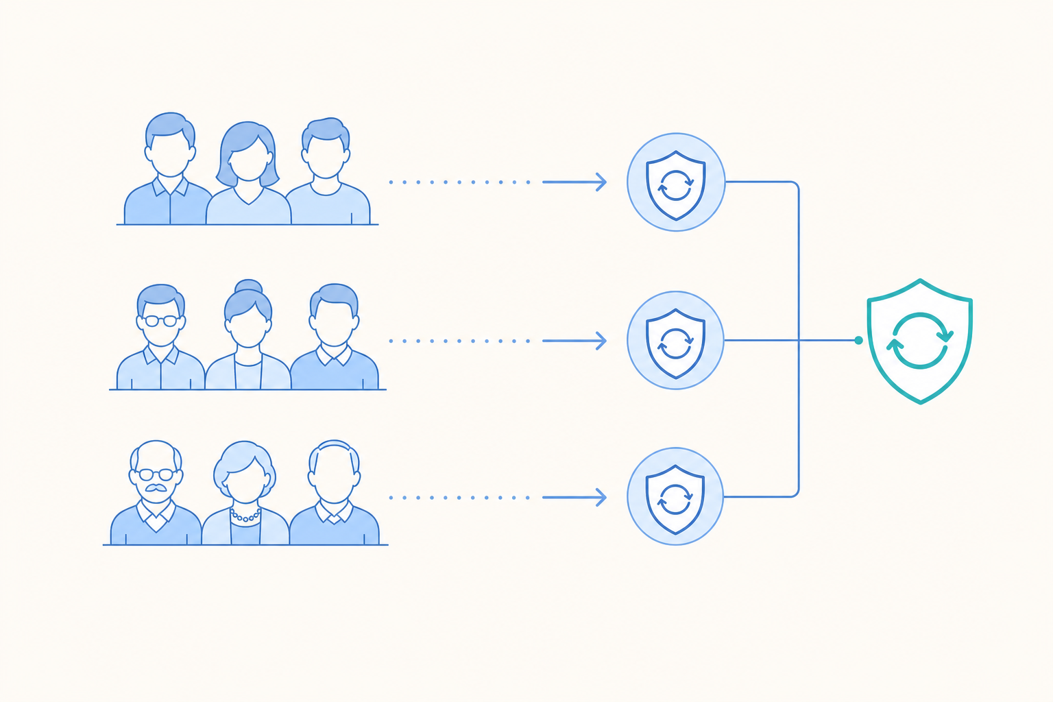
A cohort that has existed for twelve months has had more chances to churn than one created two weeks ago. Comparing calendar months without aligning lifecycle age mixes exposure time with customer behavior.
For an activation cohort, ask whether accounts reaching their first renewal are churning at a higher rate than earlier activation cohorts at the same age. If they are, inspect onboarding completion, time to first value, implementation delays, product defaults, and acquisition mix during the affected period. The pattern supports those checks. It does not prove that onboarding caused the loss.
For an acquisition cohort, compare sources at the same lifecycle point. A source may deliver many new customers while producing weak first-payment retention. Join source data to activation and renewal outcomes, then check whether the source mix changed before the headline rate moved. A change in traffic quality remains a hypothesis requiring evidence from the acquisition and product teams.
Tenure cuts show where customers leave. Plot churn by time since signup, activation, first payment, or last renewal. The shape can separate an early experience problem from a later account-value problem. A concentration during the first product period directs attention toward setup, permissions, missing integrations, or unclear value. A concentration after several renewals directs attention toward changing needs, service quality, pricing review, contract timing, or product gaps.
Segment when the cut can change the investigation. Name the question beside the segment:
- Plan: Are cancellations concentrated in a package whose promised capability is rarely used?
- Platform: Does a core workflow fail or go unfinished more often on one environment?
- Region: Do payment outcomes, support coverage, or local requirements align with the change?
- Product version: Did exposed customers show a different renewal pattern after a release?
- Company size or account value: Are losses concentrated among customers with a larger commercial effect?
- Acquisition source: Did one source produce customers who reach activation but fail to renew?
A platform chart without error and completion events only shows a difference. A plan chart without plan history can misclassify customers who upgraded or downgraded before leaving. A region chart can reflect a change in customer mix. Add the relevant exposure, behavior, or commercial field before treating the segment as evidence.
Put cohort size beside the rate and show the absolute number of churn events. A small cohort can show a large rate swing with limited business impact. A large cohort can show a modest rate change that affects many customers.
Reactivated users require a separate label. Their second lapse can follow a different path from continuous users because the account has already experienced a cancellation or inactivity period. Combining them with continuously active customers can hide the lifecycle difference.
Keep the evidence classification visible. A cohort change is descriptive. A shared movement between a product event and churn is correlational. A controlled experiment or credible comparison can support a causal conclusion.
Separate Revenue Churn From Customer Churn
The phrase “revenue churn vs customer churn” names two measures with different operational uses.
Customer churn shows how many customer relationships or subscriptions were lost during the selected period. It shows the breadth of the issue and the number of relationships that may leave the active base.
Revenue churn shows the financial movement associated with losses and contraction. It shows concentration. A few large accounts can create substantial revenue exposure while the customer count remains relatively small. Many low-value cancellations can produce a large customer count with a smaller immediate revenue effect.
Keep both measures on the same cohort and lifecycle view.
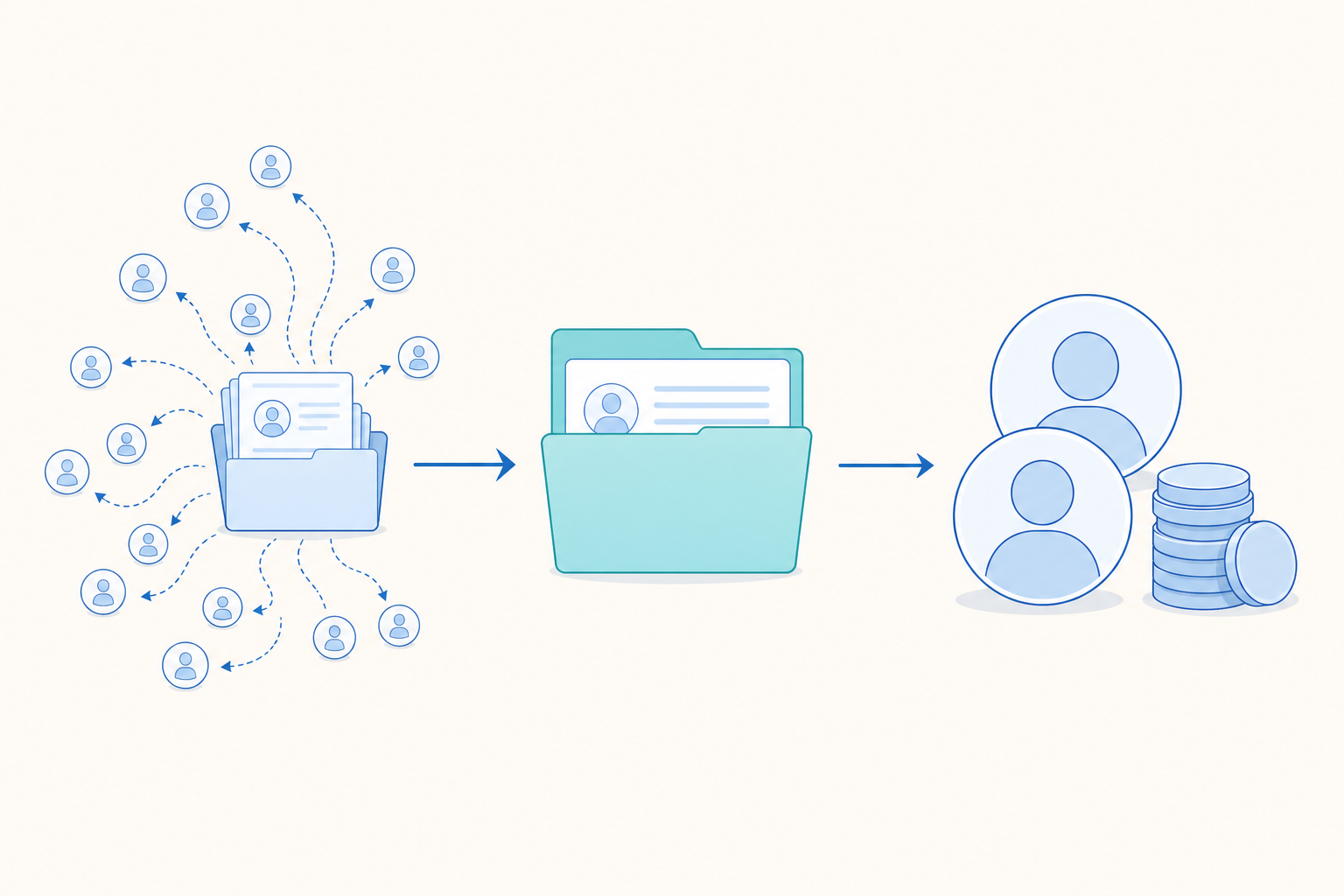
A customer-only chart can make a high-value loss look ordinary. A revenue-only chart can hide broad deterioration among smaller customers.
When the measures diverge, use the direction to choose the next cut:
- Customer churn rises while revenue churn stays stable. Check lower-priced plans, small accounts, and recent acquisition cohorts.
- Customer churn stays stable while revenue churn rises. Check larger accounts, contract value, downgrades, seat reductions, and renewal concentration.
- Both measures rise. Check whether the same cohort, plan, platform, or lifecycle stage contains both effects.
- Customer churn rises while revenue churn falls. Check expansions, upgrades, and revenue offset rules before describing the business as healthier.
A subscription cancellation can leave the account active if other seats remain. An account cancellation ends the relationship entirely. Reports that combine account, subscription, and seat events should show the entity for every number.
Revenue treatment needs its own audit trail. Record how the report handles upgrades, downgrades, pauses, failed payments, credits, discounts, and expansion. A downgrade may preserve the customer while reducing revenue. A pause may delay the event in a cancellation report. An expansion may offset contraction in a portfolio view.
Run both numbers on the same cohort before characterising the loss. Without that comparison in front of you, avoid describing the loss as broad, concentrated, commercially severe, or financially limited.
When losses cluster in a high-value cohort, connect the finding to a broader retention and LTV review through [retention and LTV operations](https://thinkingai.io/blog/how-to-increase-customer-lifetime-value/). Send the affected cohort or account group to that review to inspect renewal timing, account value, contraction risk, and possible retention actions.
What Counts as a Good Churn Rate?
There is no universal threshold for a good churn rate. A useful comparison must match the product, contract structure, customer definition, period, lifecycle mix, and revenue treatment.
A monthly customer rate for a self-serve product describes a different population from an annual revenue rate for contracted accounts. A report with many newly activated users can show a lower rate because those users have had less time to churn, while a report containing mostly mature customers has had more exposure to churn events. Comparing the two rates fails because the populations have different lifecycle exposure.
A customer rate can move in the opposite direction from a revenue rate when losses concentrate by account value.
Before using a churn rate benchmark, record the source details:
- Entity counted
- Churn event
- Measurement period
- Eligibility rule
- Lifecycle mix
- Pricing and contract model
- Customer or revenue treatment
- Publication date and sample description
Any external benchmark needs its source, its population and its calculation method attached before it can be compared with yours. A number without those three is not a benchmark you can use.
When no external benchmark passes that test, use an internal benchmark template. Build one table with the current result and at least six earlier comparable periods. Keep the entity, event, denominator, eligibility rule, revenue treatment, and calculation cycle fixed. Add the absolute churn count, eligible population, customer churn, revenue churn, and the main cohort or lifecycle cut for every period.
Use the table in three views:
- Period view: Compare the current period with the previous six comparable periods.
- Cohort view: Compare each current cohort with earlier cohorts at the same lifecycle age.
- Impact view: Compare customer movement and revenue movement with the retention objective for that period.
Treat three comparable periods as the minimum for calling a direction a readable trend. One period is an observation. Two periods show movement. Three periods moving in the same direction create a reviewable pattern, provided the definition and population stayed stable. Six periods give the team a more useful internal reference because they show ordinary variation across several operating cycles.
Use the recent internal series to set an action rule. Calculate the median rate and the normal range from the six comparable periods. A current result inside that range is a watch item when the affected cohort or revenue exposure is small. A result outside the range is a review trigger. Act when the result remains outside the range for two consecutive comparable periods, when both customer and revenue impact move adversely, or when one priority cohort shows a material change at a key renewal point. Record which condition triggered the action.
The rule should produce a short decision record:
- Current rate and absolute churn count
- Six-period median and normal range
- Current eligible population and cohort size
- Customer impact and revenue impact
- Lifecycle stage where the movement appeared
- Definition or data changes during the period
- Action owner and evidence request
- Date for the next comparison
A large movement that occurs once can be watched while the team checks the denominator, cohort size, and data pipeline. A smaller movement that persists across two periods or affects a strategically important cohort should move into active investigation. This makes urgency depend on repeatability and business impact instead of an arbitrary industry threshold.
External numbers can provide orientation. Internal trends provide the evidence for an operating decision because the team can connect them to its own cohorts, releases, acquisition sources, contract dates, and revenue records. Record any benchmark beside the report with its definition and source date.
From Churn Rate Analysis to the Next Verification
End the review with one evidence request that a person can assign, approve, and complete.
1. Which cohort changed most? Report the cohort size, churn movement, and revenue exposure. A percentage alone can elevate a tiny cohort above a materially larger one.
2. Where did the change occur in the lifecycle? Identify activation, first payment, first renewal, later renewal, expansion, or reactivation. Align observation time before comparing cohorts.
3. Did customers, revenue, or both move? Put customer churn and revenue churn beside the same cohort result. This separates broad reach from commercial concentration.
4. Which events appeared alongside the loss? Join activation completion, core workflow use, invitations, support contacts, errors, payment outcomes, and release exposure to the affected population. Each event needs a timestamp and a defined comparison group.
5. Did the measurement change? Check identity resolution, billing status, event naming, plan mapping, timezone conversion, and historical backfills. A pipeline change can create the entire visible movement.
6. What evidence should come next? Choose one action: rebuild the cohort with the corrected denominator, add a plan or platform cut, join product events to billing outcomes, review affected accounts with a customer team, or run a controlled test. A person approves the product, lifecycle, or messaging change that ships after the review.
The intervention playbook belongs in [churn prevention for subscription apps](https://thinkingai.io/blog/churn-prevention-subscription-apps/). It covers intervention planning, timing, cause-based segmentation, and win-back work. This analysis supplies the evidence for choosing a path.
Write the conclusion in one of four forms:
- Descriptive: “First-payment churn increased for the March activation cohort.”
- Correlational: “Lower core-workflow completion appeared alongside the increase.”
- Measurement-related: “The rate changed after subscription identity mapping was updated.”
- Causal: “The experiment showed that the onboarding change affected renewal.”
A causal conclusion requires experimental or comparably strong evidence. The first three should retain their evidence level in the wording.
Build a Reusable Churn Reporting View
A reporting view should let a reviewer move from the headline rate to the affected population without rebuilding the analysis each week.
Show these items together:
- Overall churn for the selected period
- Entity counted and churn event
- Eligibility rule and denominator
- Signup or activation cohorts
- Churn by lifecycle stage or tenure
- Customer churn and revenue churn
- Relevant plan, platform, region, acquisition, and product-version cuts
- Data refresh time
- Definition owner and source location
Keep the observation window fixed as the reviewer moves from totals to detail. A cohort chart based on activation date becomes misleading when the detail table silently switches to billing month. Put the period boundary in the chart title or filter label.
Every number should lead back to its definition, denominator, cohort assignment, and update time. Record changes to event names, identity logic, billing states, plan mappings, and historical data. This lets the team separate customer movement from reporting movement during the weekly review.
Assign ownership to the assumptions. Data owns source logic and calculation maintenance. Product owns event definitions. Growth owns acquisition and onboarding context. Finance validates revenue treatment. A named person approves changes to the metric and the product response.
Use this review order:
- Confirm the definition and refresh time.
- Compare the current result with comparable internal periods.
- Find the cohort and lifecycle stage with the largest meaningful movement.
- Compare customer impact with revenue impact.
- Check the strongest behavioral associations and their data quality.
- Assign one evidence or validation task.
- Record whether the conclusion is descriptive, correlational, measurement-related, or causal.
A churn report earns trust when every percentage stays attached to its population, time window, cohort, lifecycle stage, and revenue effect. The headline rate starts the review. Those details determine what the team investigates and what a person approves next.